There are a couple of developments that contributed to me redesigning my website. I'd like to divide these developments up into two categories: 1) new inspiration, 2) issues with the old design. Let's have a look at it.
New inspiration
Over the last few months, I've been reevaluating my relationship with the internet and social media. I'll share my ideas about that at a later stage, but one of the consequences was that I retreated from social media and became more active on other places of the internet. My most visited websites are Voetbalzone (for all football related news) and Hacker News. This last website is very important to the development of my ideas.
Hacker News
Hacker News is a news aggregator that brings together many different news stories that are being submitted by members of the platform. As the name suggests, most of the articles shared on this platform are technology related. But occasionally other topics will find their way to the surface as well. History, psychology, and curiosities are other popular reoccurring themes.
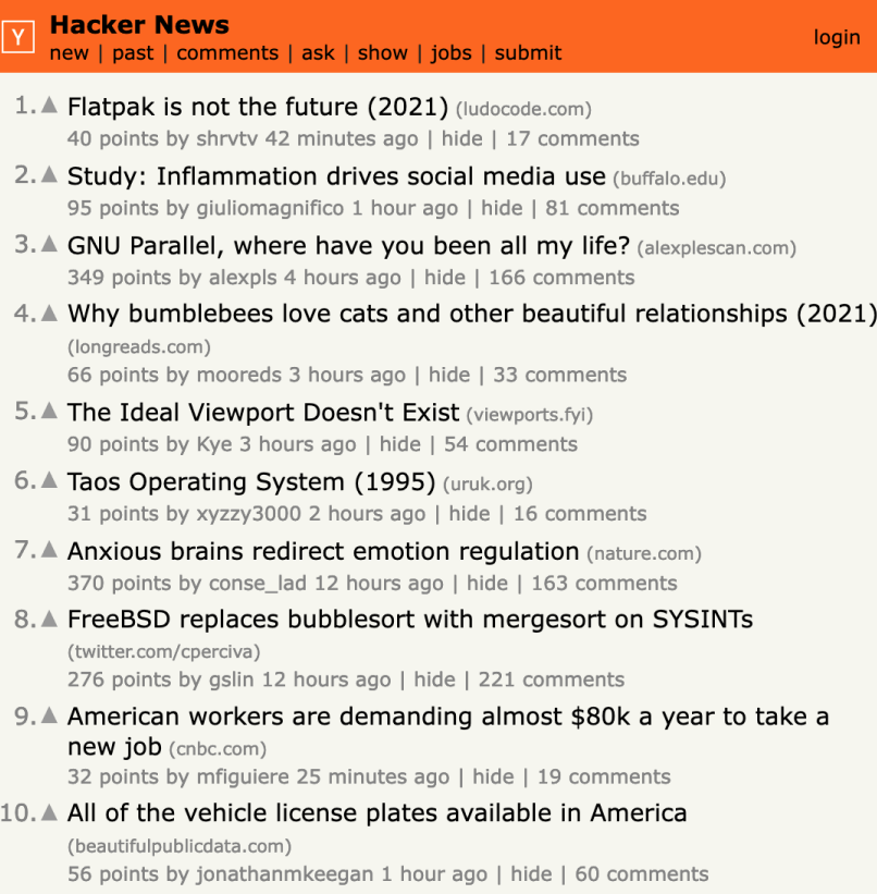
The design of Hacker News is extremely simple and straightforward. Some people might say it looks horribly outdated and not of this time. But they would miss the point. Because the web design is actually very effective. It does exactly what it needs to do, and it does that without any distractions. It's has been my favourite website for a long time now. It's fast, to the point, and desktop and mobile are exactly the same! And it also shows what the website is all about: sharing interesting information. It really made me change my views on web design.
Indie web
The cool thing about Hacker News as a news aggregator is also that it's not all about the most recent news. Sometimes people share interesting articles from 10 or 20 year ago. If the content is interesting, it will get upvoted and make its way to the homepage. Via this way I've been introduced to many very interesting topics and articles that were just published on people's personal websites.
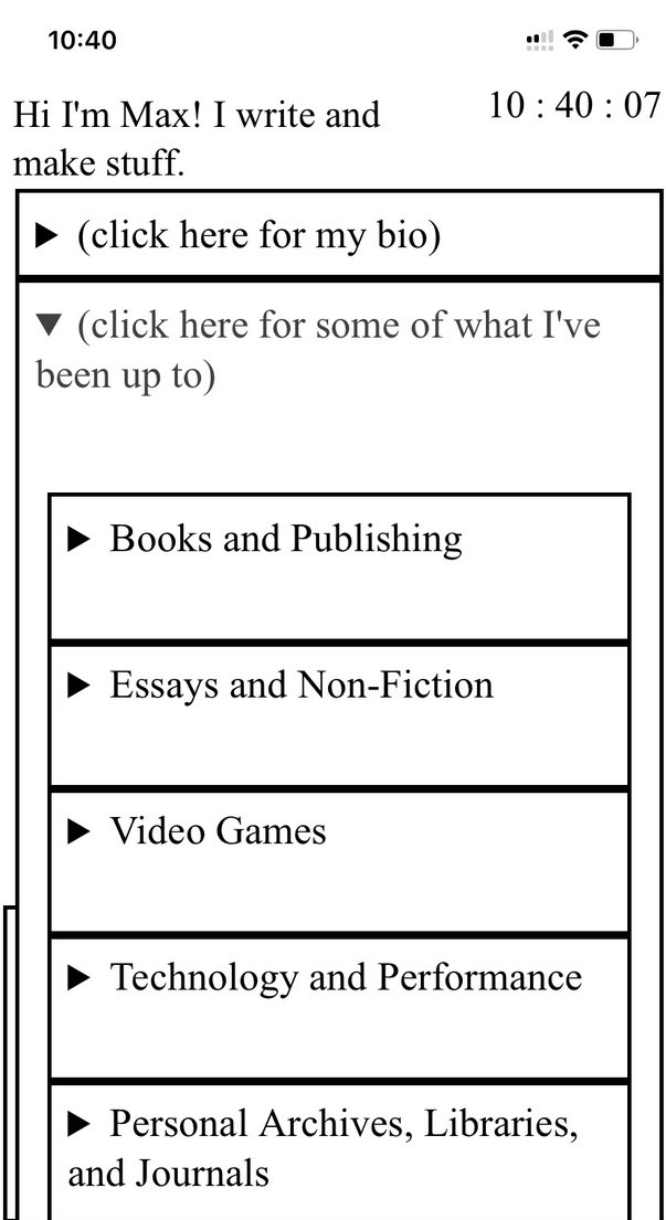
I absolutely loved the idea of these dropdown-elements on Maxwell Neely Cohen's website, so I used them on my homepage as well!
Seeing all of these personal websites gave me inspiration to redesign my own website. I started screenshotting many of the websites that I liked. Virtually all of them were very simple, text-first websites. No distractions, just straight to the point, sharing the information that the author wanted to share. No elements are hidden, everything is 'what you see is what you get'. No hamburger menus, no filler-images, or abstract design elements.
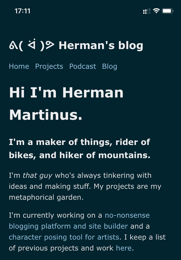
Very cool, easy UI by Herman Martinus. Mobile first, no hidden menu items. I like it.
All of these personal websites made me excited to make something fun and nice from my own website. But it also stimulated my thoughts about the structure of the internet (I also just read the book The internet is broken (but we can fix it) by Dutch internet pioneer Marleen Stikker). How should we use the internet, instead of merely interacting via the big platforms? I'm not an expert on the matter, but I find it very interesting to think about. In my search for alternative ways to use the internet, I found the Indie Web movement. They are trying to facilitate a version of the internet that relies less on big platforms, and more on independently run websites. Exactly the ideas that I support! So in my new design, I tried to incorporate a few things they suggest.
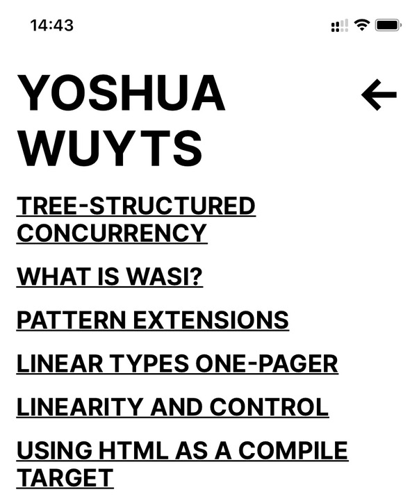
An other very cool example is Yoshua Wuyts website. Super straight forward, mobile first.
The old design
Let me start off by saying I didn't hate my previous design. I've used it for two full years and I had grown quite fond if it. But in those two years I've also learned a lot of new technologies. Like Node.js, Webpack, and Tailwind. They make the current design so much more accessible and the performance so much better.
The issues
-
Lack of narrative and context
- The old homepage was displaying a lot of articles, but it was doing so without any context. This meant that the impression each new visitor would get of me was solely based on what ever I had published most recently. To mitigate this risk, I am now accompanying each section on the homepage with a little written introduction and links to my favourite related articles. I think that does a better job at telling the story I would love to share.
-
Way too many external scripts (half of which I had forgotten why I used them)
-
Bootstrap
-
Mailchimp
-
TocBot
-
Swiper.js
-
Popper.js
-
jQuery
-
-
Too many images
-
Even though they were all sized correctly to a very small thumnail size, it was still a big amount of pictures that was being loaded every time. And the worst thing: I absolutely loathed making these thumbnails! Well, maybe that's a little bit harsh, but it is true that for some articles it didn't make sense to have a thumbnail. There was simply no need for it. So then I had to source some semi-random image of design something silly. And if I wanted to use an image that I already used in the article itself, then it would be displayed twice when you open the article (once as featured image, and once as regular in-text image). All that work for something not super relevant.
-
I'm sure that it's probably better to have thumbnails to get people to click on your articles, but since I'm not in the business of clicks anyway that is irrelevant to me. I'm sharing stuff on this websites for people that are interested in it, I'm not trying to convince people that what I say is interesting. So if the title cannot convince you that the content is interesting, the thumbnail also shouldn't.
-
Cool things
Like I said before, I didn't change my old design because I hated it visually. I still kind of like it. And that's why I'd like to pay a little homage to all the things that I did like about it.
-
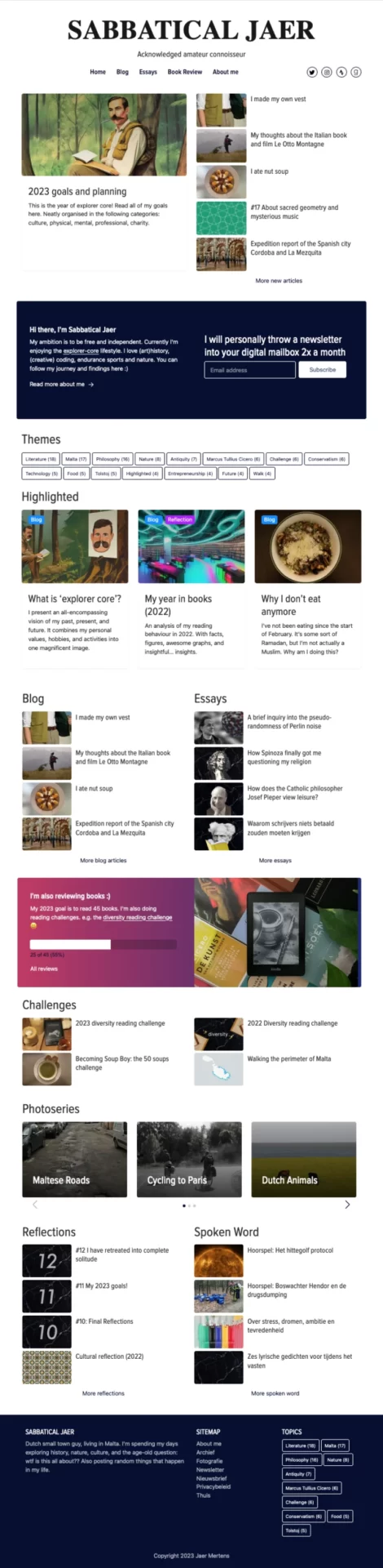
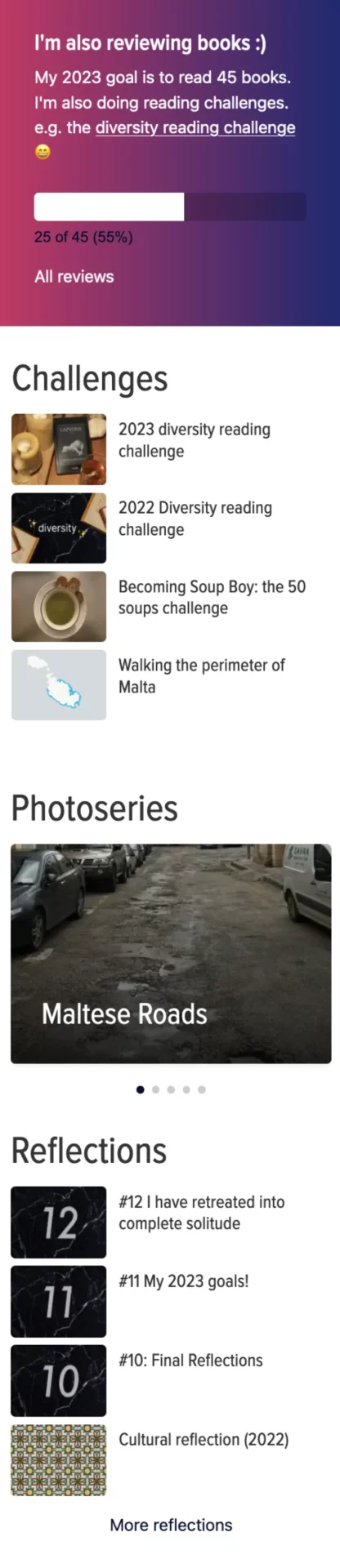
'Hacked' Goodreads widget
- Customised the prefab Goodread widget into my personal widget. Looked pretty neat I think.
-
Four different ways of displaying posts
- I appreciate the diversity visual representations of blog posts (on desktop). There was the pinned article at the top, regular articles, highlighted articles, and a carousel of photo series. That made the website visually quite diverse I think.
-
Interesting variation of elements
- I think the website had a nice variety of design elements. Lists of articles were interchanged by coloured blocks of other information. Like the short bio, the hacked Goodreads widget, or the newsletter sign-up.
-
Static side bars on desktop articles
- I very much loved the static side bars on desktop articles. Especially the table of content was very handy to have there. It showed how far into the article you were, because it would highlight the section in the ToC where you were.
Cool static side bars.
Screenshots of the old design
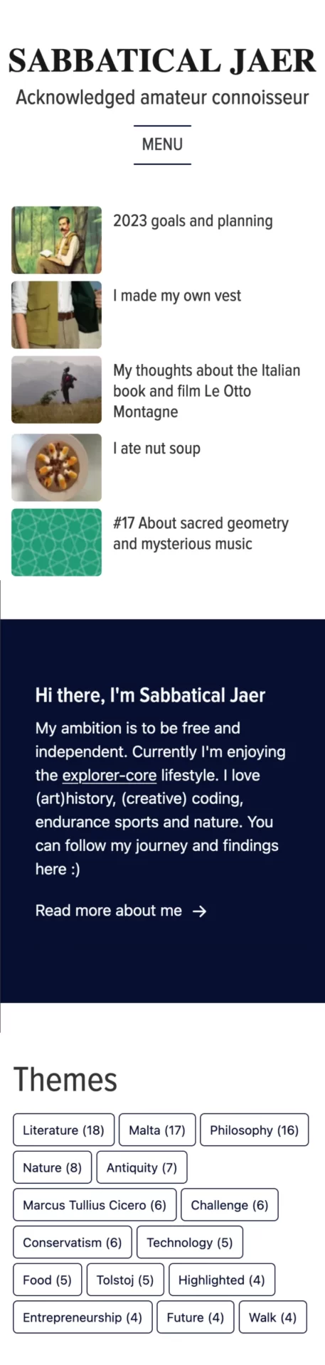
Below you can find a few screenshots of the home page (desktop and mobile). They are meant to give you a bit of an idea of the layout of the design, therefore I didn't deem it necessary to share them in the highest of qualities.
Desktop homepage
Mobile homepage
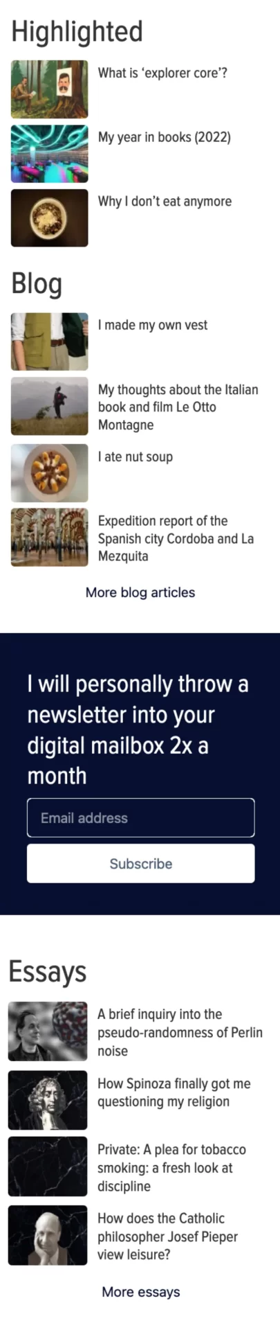
Article deskop
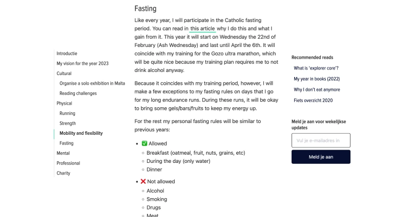
Massive displayed 'featured photo'. And what's the purpose of the 'featured photo' anyway? I found myself struggling to find a good 'featured photo' a lot of times, but I think their functionality is minimum. Yes, maybe they work well as a preview picture when you share links, of on the homepage. They help making links appealing. But I'm a bit tired of the dominance of visual elements. The reign of the visual is over, the time of text has returned!
Enormous amount of information displayed. Bit too much I'd say. I simplified this in the new design.